Archive of Biomedical Science and Engineering
Data mining and data visualization for analysing the rate of bed availability at hospitals due to COVID 19
1Pursing Computer Science and Engineering, Presidency University, Bengaluru, India
2Vinitha Dominic K, Assistant Professor, Department of Computer Science and Engineering, Presidency University, Bengaluru, India
Author and article information
Cite this as
Thanuj Kumar S, Vinitha Dominic K, Sumathi V (2021) Data mining and data visualization for analysing the rate of bed availability at hospitals due to COVID 19. Arch Biomed Sci Eng. 2021; 7(1): 001-004. Available from: 10.17352/abse.000023
Copyright License
© 2021 Thanuj Kumar S, et al. This is an open-access article distributed under the terms of the Creative Commons Attribution License, which permits unrestricted use, distribution, and reproduction in any medium, provided the original author and source are credited.This study started in July 2020 during the COVID 19 pandemic period to analyze & visually illustrate insights of data of biomedical facilities’ information. The objective of this study is to present major issues faced, solutions found, and a roadmap for future work in developing visual analytics for interactive & data visualization for biomedical facility applications. This chapter starts with a brief introduction of data mining and data visualization, followed by a description of data mining tasks and we’ll build a decision tree model, followed with the concrete examples on various data visualization charts(namely Histogram, Bar Chart, Pie Chart, Line graph, etc), this paper which is intended for visual analysis of “Bed availability rate” in hospitals and decision support for patients and is based on Data Mining & Visualization techniques.
In recent times demand has risen for patients’ health affected by a coronavirus, so that healthcare should be delivered at the appropriate health center, by the appropriate analysis, with the appropriate means at the level of individual patients to fight against the widespread of coronavirus. This study aims to provide data integration across heterogeneous biomedical facilities (like no. of beds available) information to facilitate improved data insights, visual analysis and ultimately to be stepping stone for future trends in this study.
Data stored in large databases are not always comprehendible by human beings, it needs to be cleaned, sorted, and analyzed first, stored records are raw amounts of data-poor in accurate insightful information, not only because is it abundant and seamlessly irrelevant but also continuously increasing, updating and changing. Here is where data mining and visualization comes into the picture. Data mining and visualizations are knowledge discovery tools used for the analysis of data stored in large sets in many different ways as these large data cannot manually predict the outcomes mining tools and visualization techniques provide automated means to comprehend such continuously changing data sets. Data mining is defined as the automated process of finding patterns, future results, and trends in the data set. On the other side, data visualization is the process of visually communicating and representing the data to bring insights out of it. Human brain able to understand and comprehend visual graphics more easily than numbers and letters. Human brains can absorb graphs, charts, and models quicker than digits in text format. Visualization of such graphical data helps the human brain figure out the insights and recognize such knowledge hidden in the data. The goal of data visualization is to not only summarize the abundant dataset but also provide a better way of exploring the knowledge hidden and quickly perceive the insights autonomously [1-10].
In the next section, we shall demonstrate the Data Visualization Methods to visually analyze the availability of major hospital facility i.e Beds by using various Data Visualization charts.
Methods
Data mining tasks
The data mining undertakings can be arranged for the most part into two sorts dependent on what a particular assignment attempts to accomplish. Those two classifications are descriptive tasks and predictive tasks. The descriptive data mining task describes the overall properties of information while predictive data mining tasks perform derivation on the accessible informational collection to foresee how another informational index will carry on.
There are different data mining tasks, for instance, game plan, desire, time-course of action assessment, association, clustering, overview, etc. All of these tasks are either predictive data mining assignments or enchanting data mining tasks. A data mining system can execute at any rate one of the above-demonstrated undertakings as a significant part of data mining.
In this work, we are utilizing Decision Tree Classification for Patients, which helps in choosing to get admitted to a correct emergency clinic dependent on the accessibility of beds.
Visualizing decision tree
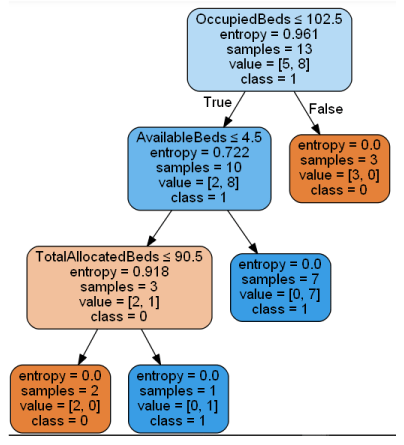
A decision tree is a flowchart-like tree structure where an internal node speaks to a feature(or property), the branch speaks to a decision principle, and each leaf node speaks to the result. The highest node in a decision tree is known as the root node. It figures out how to segment on the premise of the characteristic worth. It parcels the tree in a recursive way called recursive partitioning. This flowchart-like structure causes you in dynamic. It’s representation like a flowchart chart which effectively copies the human-level reasoning. That is the reason decision trees are anything but easy to understand and interpret.
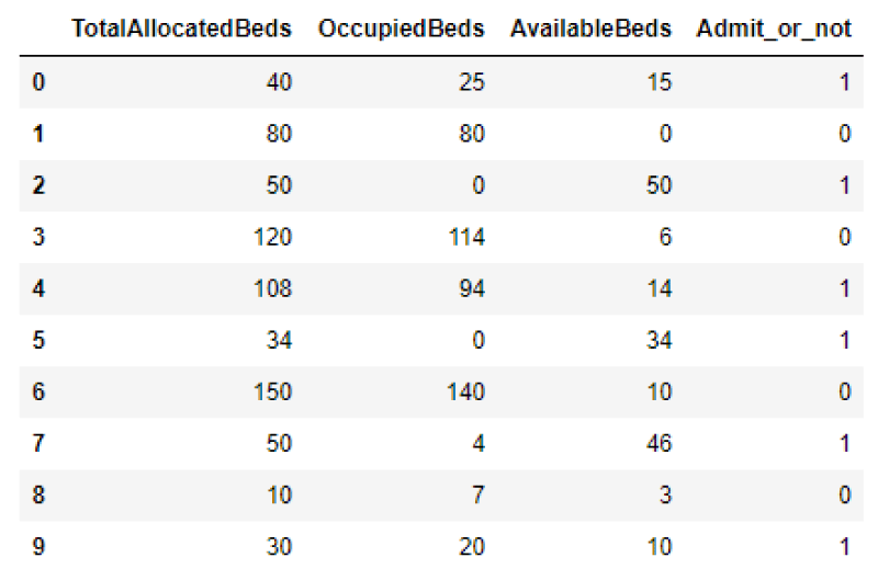
Decision Tree is a white box kind of ML calculation. It shares inside dynamic rationale, which is not accessible operating at a black box sort of calculations, for example, Neural System. Its preparation time is quicker which is contradiction with neural system calculation. The time complication of decision trees is aimed at the number of records and the number of attributes in the provided data. The decision tree is a dissemination free or non-parametric strategy, which doesn’t rely on probability. Decision trees can deal with high dimensional data with great precision. Sample Data-set for which we apply the decision tree algorithm:
Now we perform Importing Required Libraries, Loading Data, Feature Selection, Splitting Data, Building Decision Tree Model by training the classifier, Evaluating Model (Prediction).
After Training a decision tree classifier followed by prediction, our model got an accuracy of 83.33%
Now Visualizing Decision Tree
Data visualization techniques
Data Visualization Techniques are valuable for the introduction of data in graphical form. It makes a different individual comprehend the essential of data by summing up and introducing tremendous measures of data in a basic and straightforward configuration and conveys information adequately.
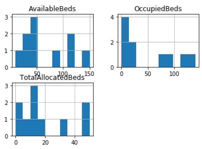
Histogram
A histogram is a sort of diagram that has wide applications in insights. Histograms give a visual translation of numerical information by showing the number of data points that exist in a range of qualities. These ranges of qualities are called classes or bins. The recurrence of the information that falls in each class is portrayed by the utilization of a bar.
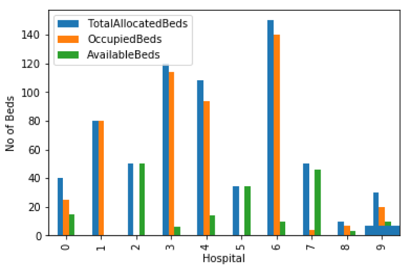
Bar graph
A bar outline or bar diagram is a graph or chart that presents all-out information with rectangular bars with statures or lengths corresponding to the qualities that they speak to. The bars can be plotted vertically or on a level plane.
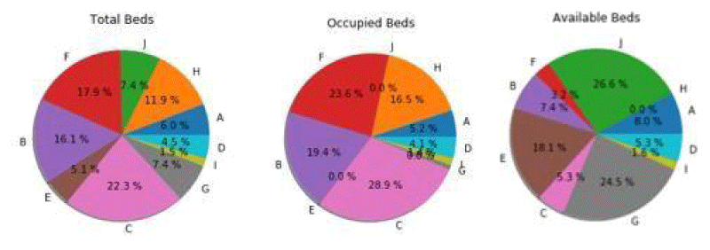
Pie chart
A Pie Chart shows a static number and how classifications speak to a part of an entire structure of something. A pie diagram speaks to numbers in rates, and the all-out whole of all portions needs to rise to 100%
Note: Alphabets in Pie chart are representing the Hospitals.
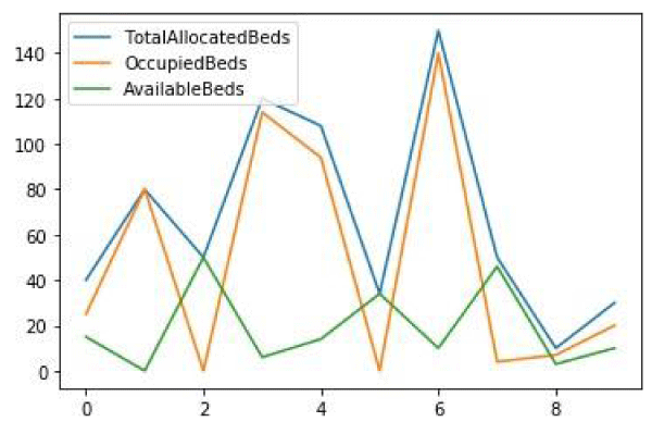
Line chart
A line diagram or line plot or line diagram or curve outline is a kind of graph which shows data as a progression of data points called ‘markers’ associated with straight-line fragments.
Result and conclusion
We describe the results of our analysis, which showed the rate of bed availability in hospitals based on their other related attributes.
We started with the Decision tree which plays a vital role in making decisions, as a result, which helps in predicting the right hospital which has a high rate of bed availability for patients to get admitted. We then demonstrated data visualization with various charts to visually analyze the status of hospital beds availability.
Meanwhile, More than 80 percent of the information that our brains are processing is visual. visuals communicate much more and most of the information, in a much faster way.
So it’s important to know that visual insights of data can be more effective and also easy for people to make firm decisions faster.
Keeping these scientific considerations in mind, analysis of charts using visualization and data mining techniques we started this study.
This is an important finding in easy understanding and analysis of the visual results obtained from techniques of Data Mining and Data Visualization which can be implemented in real-world scenarios.
Future works
Developing mobile application
Mobile Application that shows all the statistical reports and visual charts about the COVID Cases and the number of beds available in city hospitals. This app should have real-time information consistently updating which can be linked to the disaster management control room and control rooms of each ward in the city.
So the users will be updated to the information about each hospital and further, we can add the feature to book the beds in particular hospitals. It will be even more helpful if we could add the option to track the nearest ambulance and call concerning user location just like booking a cab. This mobile application will help patients in getting an ambulance and hospital bed with as much easy as getting as a cab.
Conclusion
In the present study, the data mining model was developed for predicting whether patients should admit or not, concerning hospitals’ bed availability rate. The model developed with data mining‘s decision tree was found to be efficient with the percentage of accuracy of 83.33%.
Decision tree algorithm and followed by data visualization techniques like histogram, bar graph, pie chart, and line chart were applied directly on the dataset using a python programming language.
The developed model and visual charts would be very helpful for patients and the healthcare sector to visualize the bed availability rate and to make a firm decision to navigate directly to the appropriate hospital.
- Al-Turaiki I, Alshahrani M, Almutairi T (2016) Building predictive models for MERS-CoV infections Using data mining techniques. JInfect Public Health. 9: 744-748.Link: http://bit.ly/3cK0W79
- Liu Y, Gu Z, Xia S, Shi B, Zhou X, et al. (2020) What are the underlying transmission pat terns of COVID-19 outbreak? An age-specifc social contact characterization. EClincial Medicine. Link: https://bit.ly/3tuQB5C
- Monitoring Novel Corona Virus (COVID‐19) Infections in India by Cluster Analysis Sanjay Kumar1.
- Visualization Techniques for Data Mining Viktor, Herna L (2006 Paquet, Eric . Link: https://bit.ly/3tuV8oC
- Han J, Kamber M, Kaufmann M (2011) Data Mining: Concepts and Techniques, 3rd Edition The Morgan Kaufmann Series in Data Management Systems.
- Venkatalakshmi B, Shivsankar M (2014) Heart disease diagnosis using predictive data mining, International Journal of Innovative Research in Science. Engineering and Technology. 3: 1873-1877.
- Sandhu R, Sood SK, Kaur G (2015) An intelligent system for predicting and preventing MERS-CoV infection outbreak. The Journal of Supecomputing. 72:3033-3056. Link: https://bit.ly/3bQM3k5
- Quinlan R (1993) Morgan Kaufmann Publishers; San Mateo, CA: 1993. C4.5: Programs for Machine Learning.
- Bauer E, Kohavi R (2000) An empirical comparison of voting classification algorithms: bagging, boosting, and variants. Machine Learning. 36: 105-139. Link: https://bit.ly/3vsnVfo
- Majali J, Niranjan R, Phatak V, Tadakhe O (2015) Data mining techniques for diagnosis and prognosis of cancer. IJARCCE. 4: 613-615. Link: https://bit.ly/3eOz2cQ
Article Alerts
Subscribe to our articles alerts and stay tuned.
 This work is licensed under a Creative Commons Attribution 4.0 International License.


 Save to Mendeley
